
In 1969, King Crimson shocked the music world with its peerless debut album, In the Court of the Crimson King. Yet even before one could peel away the plastic wrap, remove the album from its sleeve, and play it, a strong and sustaining impression was made via the cover art. Created by Barry Godber, the stark painting of the anguished face of a horrified man, the back of whose head was splitting into celestial space, gave an early and accurate representation of the music that lay within. Such is the power of art, and the synergy of art and music together.

The following year, Gentle Giant released its eponymous debut album. Its cover, too, bore artwork (by George Underwood) depicting a giant face. This face, however, was pleasant, smiling. Opening the gatefold, one could see that the giant face was, indeed, the face of a giant. A gentle giant, if you will. And it, too, was an indicator of the divergent styles of music on the record: a mixture of strong and sweet, brutal and delicate, pounding and lilting. But there was more. There was the name of the band—Gentle Giant—set in an old-fashioned blackletter typeface, one that suggests a time several centuries in the past, the Middle Ages.

There is no doubt in my mind that this particular typeface was chosen to evoke a medieval feel for the album, the band, and the music. Few bands have ever worn the adjective “medieval-sounding” so well. Through varied, untraditional instrumentation—including violin, cello, harpsichord, and recorder—complex choral arrangements as on “Knots” and “On Reflection,” and anachronistic subject matter (“Pantagruel’s Nativity,” “Raconteur Troubadour,” and “Proclamation”), Gentle Giant’s music was intentionally out of its time.
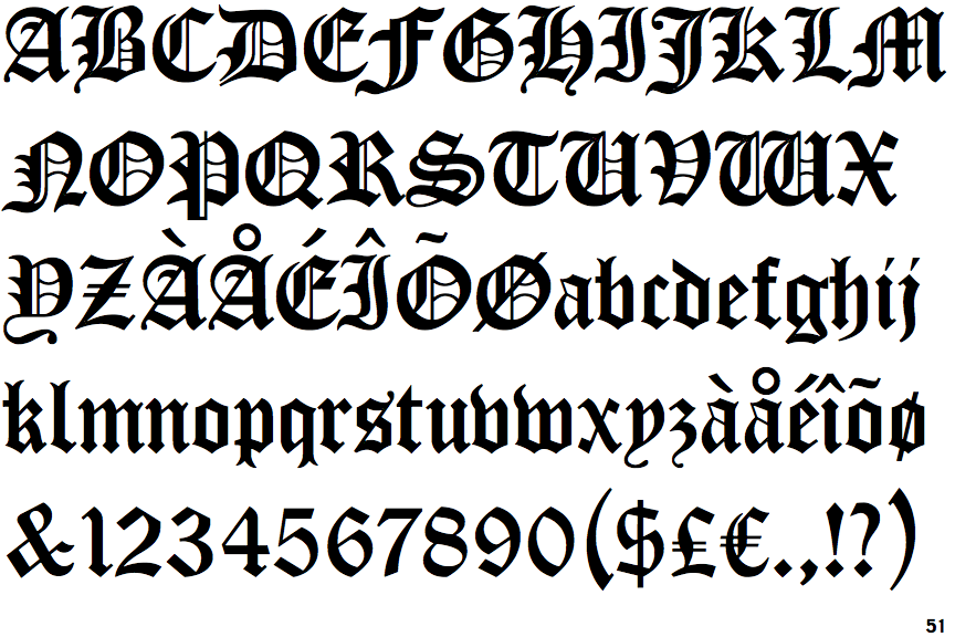
The typographic term “blackletter” refers to European gothic script-style typefaces that date back to the 12th century. The particular typeface used on Gentle Giant’s first album (not just for the name on the cover but also for all the text in the gatefold) is called Cloister Black. It was designed in 1904 by Joseph Warren Phinney and Morris Fuller Benton, two type designers who were also executives of American Type Founders, created in 1892 through the merger of 23 different type foundries. Type historians disagree about the nature of their collaboration: some believe it was fully the work of Benton, though the lowercase characters are identical to Phinney’s earlier Flemish Black, which he designed in 1902.
Despite how perfectly Cloister Black matched the style of the group in whose name it was set on that first album cover, it did not appear on their next three albums. The band’s name and album titles were hand-lettered on Acquiring the Taste (1971), Three Friends (1972), and Octopus (1972), the last one by Roger Dean who, of course, designed the iconic logotype for Yes the same year. (It should be noted that the U.S. release of Three Friends used the artwork from Gentle Giant, but the band name and album title were set in a different blackletter typeface called Fraktur.)

For 1973’s In a Glass House, there was a return to using type on the cover, though the band name and album title were set in a typeface called University Roman, an ornate and elegant design that debuted in the mid-20th century. With its eclectic mix of very narrow and very round letterforms, it also mimics the gentle/giant dichotomy of the band’s music, while adding style to the highly innovative cover design.

It was not until Giant’s sixth album, The Power and the Glory (1974), that Cloister Black made its return, and here it was promoted from being merely a type choice to being the band’s official logotype. The concept album about political corruption may have been a commentary on modern-day events (coming out just a year after the resignation of Richard Nixon), but the cover artwork suggested a corollary to more ancient times, of kings and knights, and Cloister Black was perfectly suited to it; the font was also used on the inner sleeve for the song titles.
Both on Gentle Giant and The Power and the Glory, Cloister Black was set in solid black. For the next three albums, it would be set differently each time. On 1975’s Free Hand, the logotype appears in all red; on the following year’s Interview, it’s set in rainbow colors; and it’s knocked out in white on 1977’s Playing the Fool. All three albums feature the logotype in the upper right corner: Free Hand and Interview set horizontally, Playing the Fool diagonally. Though the logotype is centered on The Power and the Glory, its size is more or less the same on all four albums, creating a strong and readily identifiable brand mark. (This is quite distinct from how it is set on Gentle Giant: a much smaller size, and stacked with “Gentle” appearing above “Giant.”)

With the advent of The Missing Piece in 1977, the band were clearly trying to position themselves more in the current musical mainstream. Although Cloister Black would not have been out of place representing such songs as “As Old As You’re Young” and “Memories of Old Days,” its association with medievalism and the band’s past made it unsuitable for the new direction. Instead, The Missing Piece features a modern geometric typeface called ITC Avant Garde. It is as simple as Cloister Black is complex, though it is an attractive and impactful design. On Giant’s last two albums, Giant For a Day (1978) and Civilian (1980), the band name and album titles are hand-lettered.

The Cloister Black logotype appears on various compilations and unofficial live releases, as well as on the new boxed set,
Unburied Treasure—though not, oddly enough, on the cases of the group’s two official live DVDs. Though it’s basically a straight use of an existing typeface (not stylized or customized in any way), the Cloister Black logotype is a perfect visual representation of what fans would consider the classic Gentle Giant sound. It takes its place with the logos and logotypes of other great progressive bands like Yes, Genesis, ELP, Magma, Kansas, and others.
